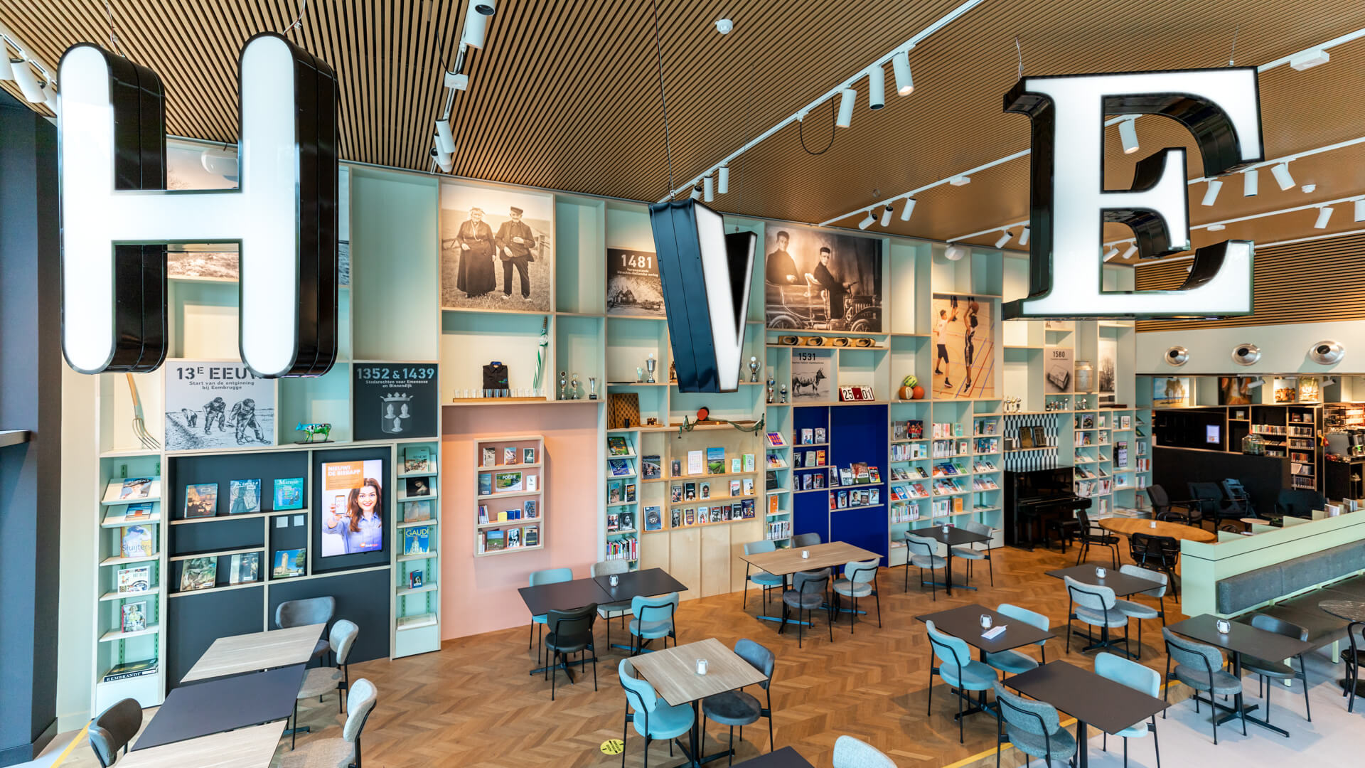
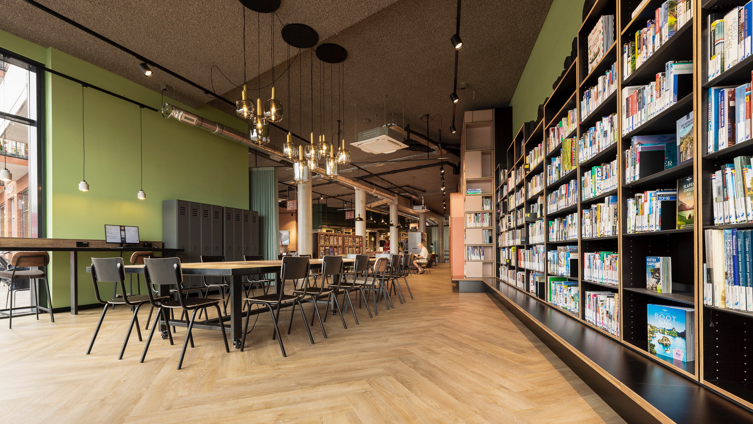
Color does more than brighten up a space: it sets the mood, influences how spacious a room feels and can even steer behavior. Yet the use of color in interiors is often underestimated. Libraries, for example, regularly choose standard white walls—a white canvas that makes the interior stand out. But did you know that white actually works as a visual “stop”? It unintentionally draws attention as a background. So, how do you use color well?
A rainbow of possibilities... now where to begin?
Choosing color isn’t an exact science; it’s about experience, mood and identity. Start with a concept: what does your library represent? Can you incorporate local elements into the color palette? A mood board or Pinterest board helps collect inspiration and create a cohesive plan.
Note: two beautiful interior elements can clash when combined. Start with colors that match existing elements you want to keep, like a couch. Build from there and choose shades that enhance the space as a whole.
Working with a tight budget but still want to add color? Go bold. A small wall gets lost behind bookcases, but a color that extends across the wall and ceiling makes an immediate impact. Not confident with color? There are plenty of handy palettes available online!
Find the balance
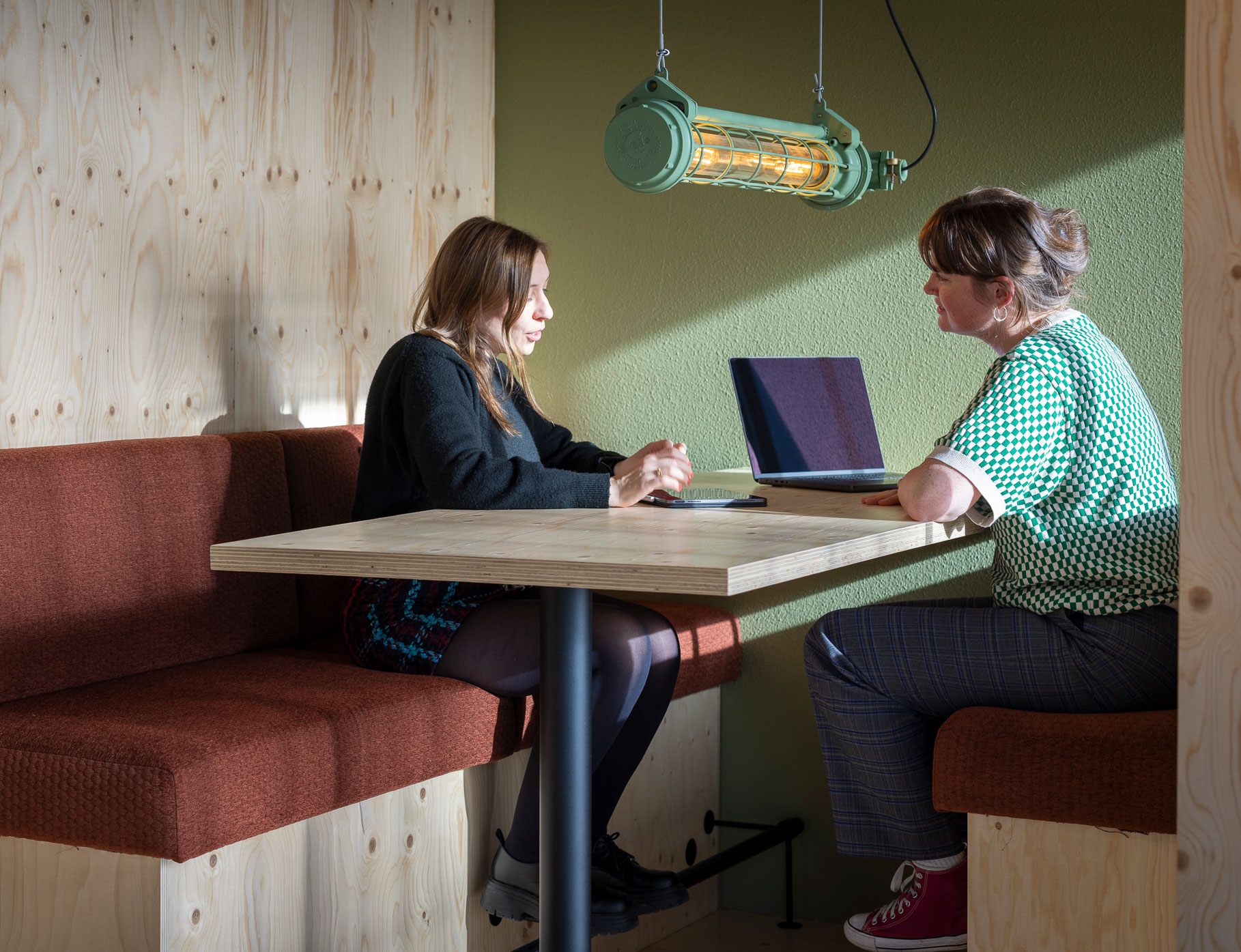
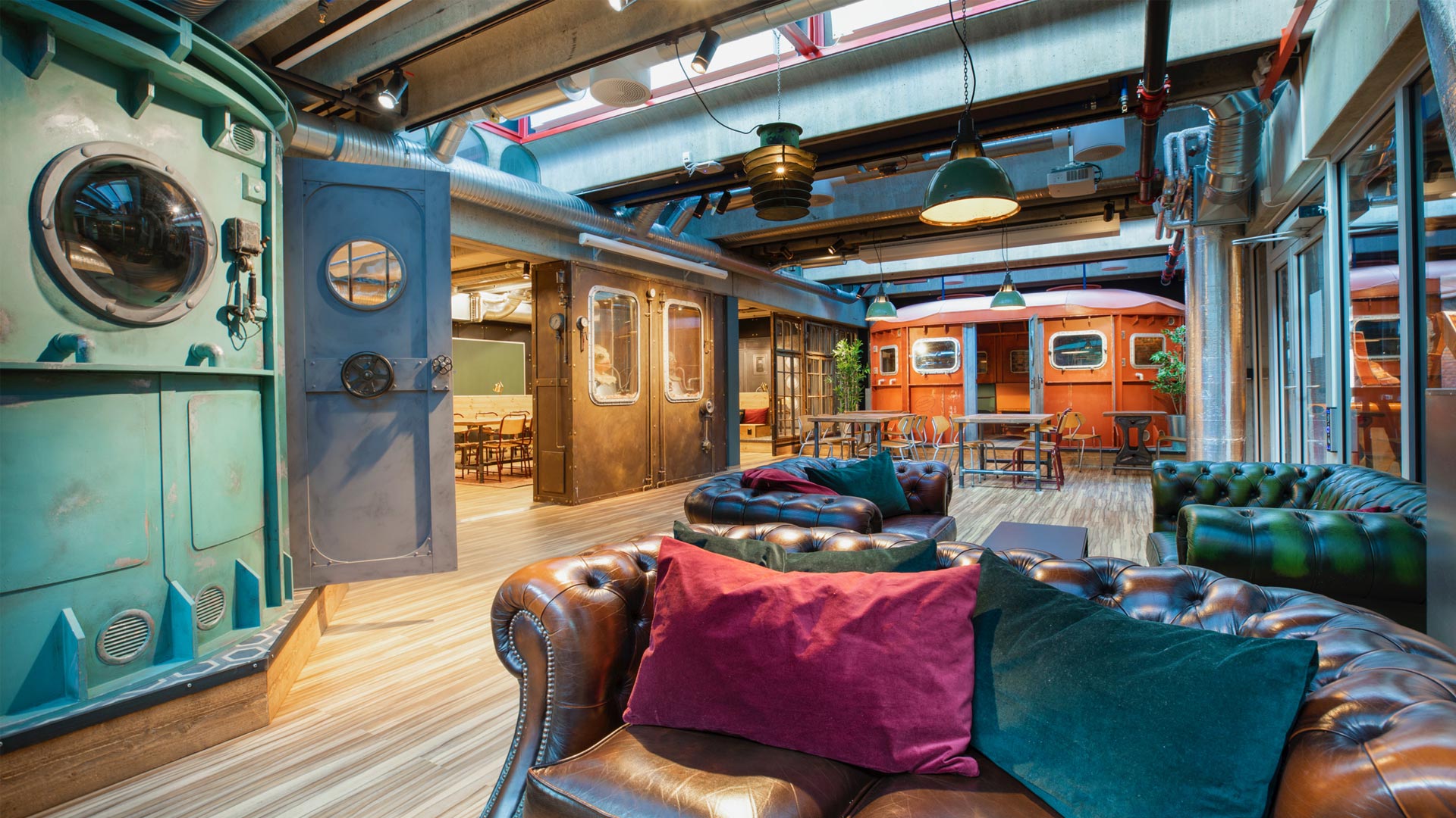
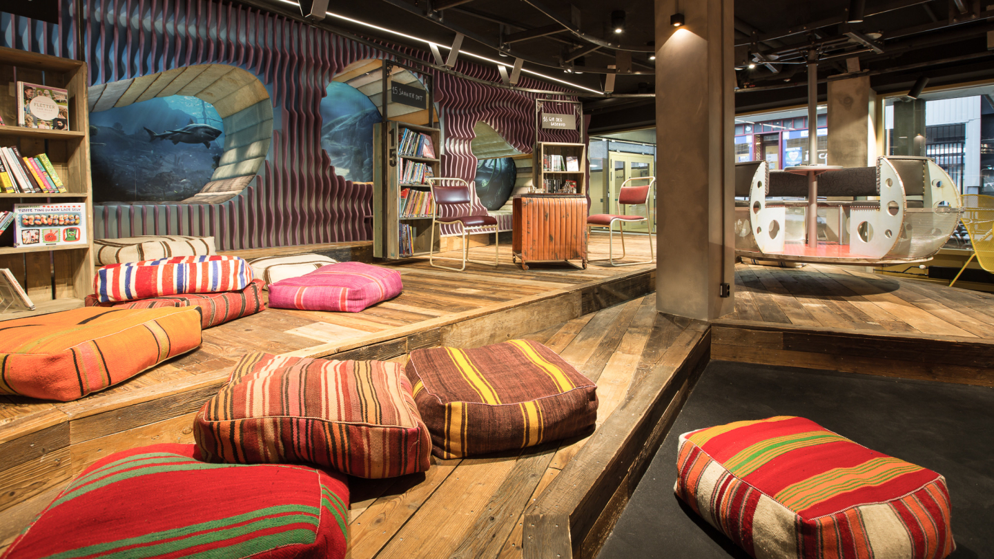
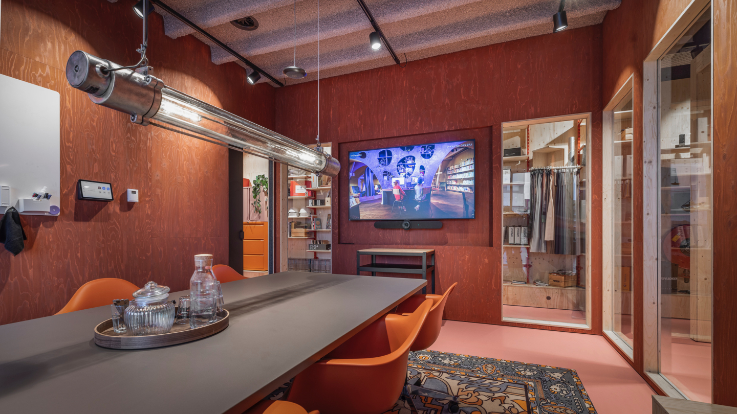
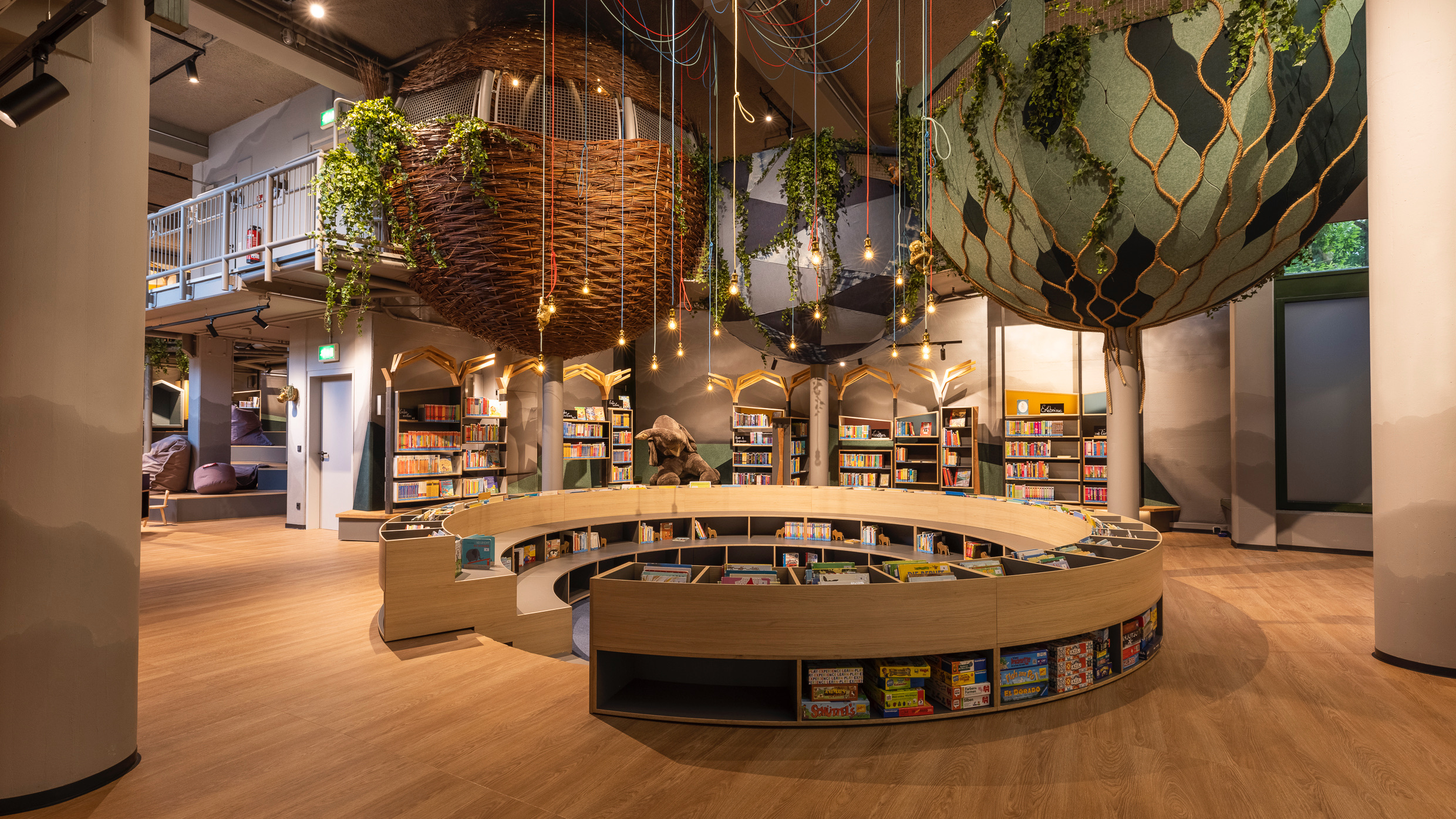
Write it on a sticky note: striking color use is all about balance. Want dynamism? Choose contrasting colors. For calm, use ton sur ton shades within the same color family and combine them with different materials. Nuances of one color create cohesion without becoming boring. There are no forbidden colors, but how you apply them makes the difference.
Neon yellow chairs at the reading table? They might be too overpowering and disturb focus. But a playful yellow lamp in a meeting space can add energy. Black flattens shapes and removes depth, which can sometimes be powerful. Want more layering? Choose a deep, dark tone that adds warmth and atmosphere without becoming oppressive.

A space that feels alive
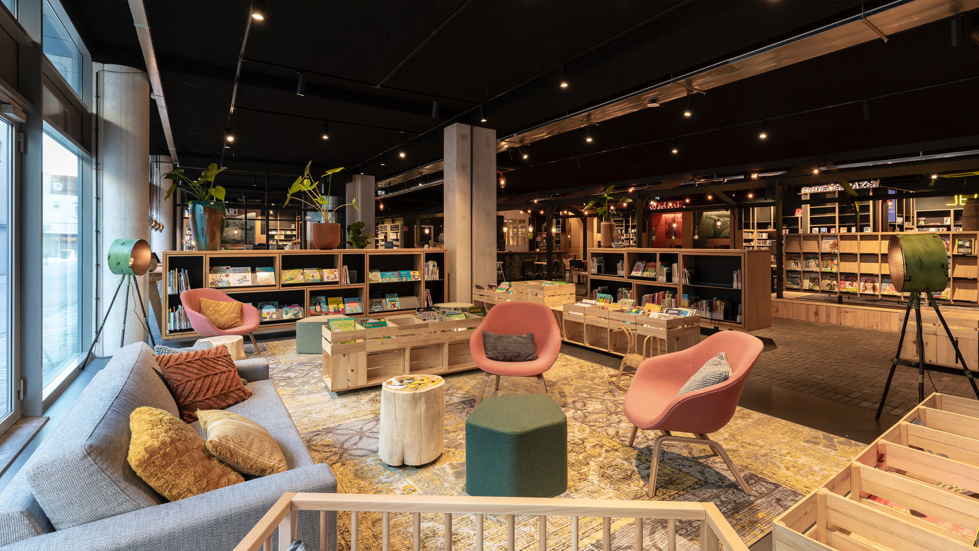
Color doesn’t have to be applied perfectly or by strict rules. It should match the library’s identity and contribute to the visitor experience. A colorless space quickly feels distant, while a well-considered mix of tones, textures and materials creates a welcoming and lively environment.
So, dare to play with color! Make conscious choices, experiment with contrast and let your library come to life.
Tips: How to Choose Colors That Work
- Walls: White as a base seems safe, but a (subtle) color helps the interior stand out better.
- Ceilings: Dark ceilings make a high space feel more intimate; light ceilings make a low space feel visually higher.
- Floors: Painting isn’t ideal, but colored carpeting or rugs can mark zones. Exception: a concrete floor in a MakerSpace can be lacquered or sponge-painted for a refresh.
- Furniture and accessories: Large furniture in neutral tones is timeless. Add playful accents with interchangeable accessories like colored pillows, vases and plant pots.
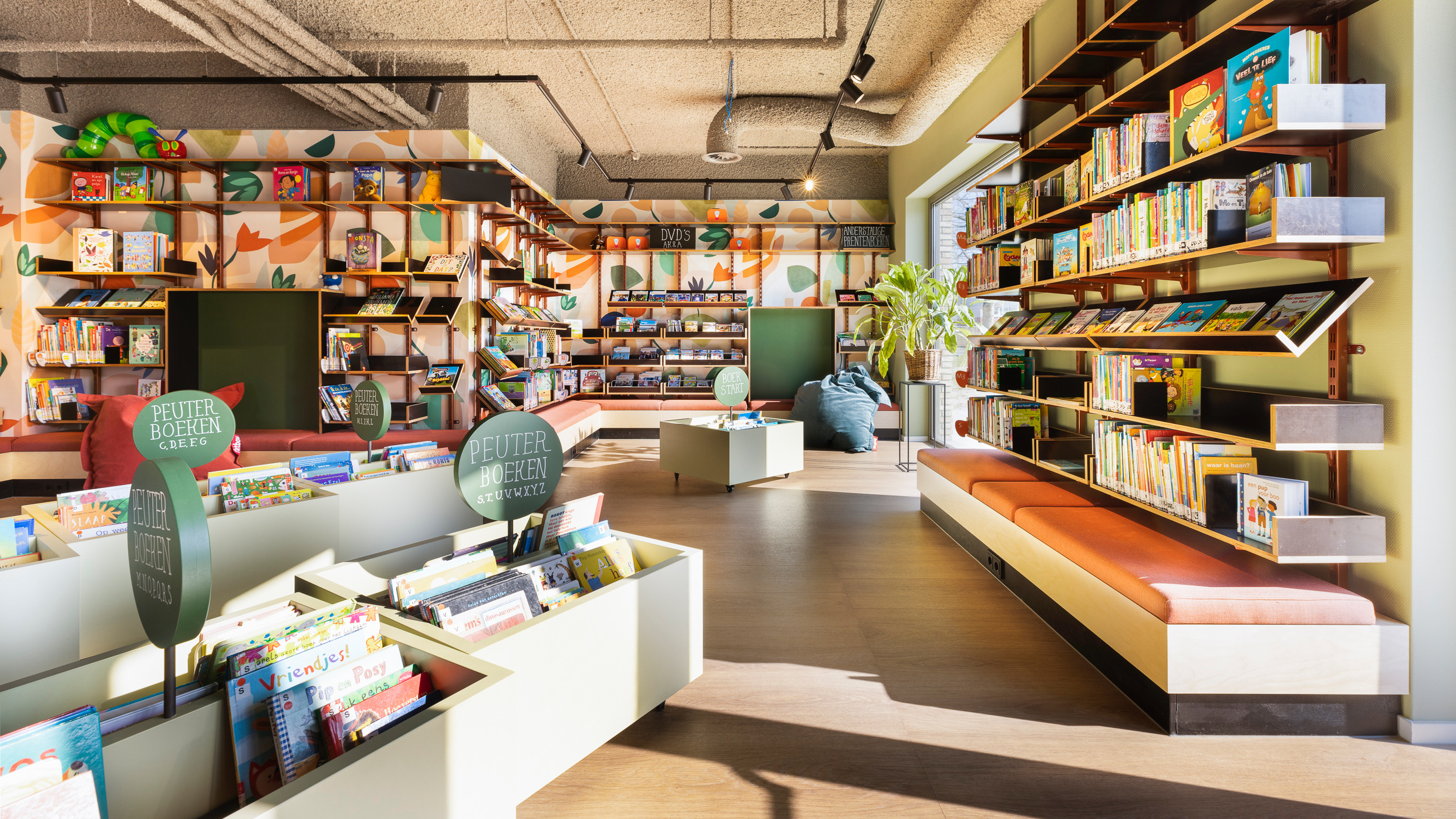
- Prints and patterns: These set the tone for a space – ideal for the youth section or informal areas.
Discover our inclusive places